Digital Agency Wireframe Design (Mobile)
Digital Agency Wireframe Design (Mobile)
Originally Created on June, 2018
Introduction
Sometime around mid-April of 2018, I managed to find a mentor for UX design and started volunteer work. The very first assignment for the volunteer work was creating wireframe drawing based on the specifications from the creative brief.
The Challenge
In this assignment, I was tasked to create a low-fidelity wireframe drawing based on the creative brief provided by my mentor. NOTE: The content of the portfolio has been modified to protect the privacy of the individuals / organizations.
The Approach
- Mobile or Desktop First?
One of the first questions that came to mind was which wireframe to create: mobile or desktop? I concluded that mobile wireframe would come first for many reasons, mainly the limited screen real estate. - Tools Used
I used the tool called Affinity Designer. This software is similar to Adobe Illustrator in terms of features and functions. - Design Layout
For the mobile wireframe, I chose Apple iPhone X for the screen size, being that iPhone X is one of the recent mobile devices as a time of writing. The main foundation of the wireframe design is based on the UI guideline documentation that is found here.According to the guideline, the portrait dimension for this device is 1125px × 2436px at 3x of the size. And the approximate margin (gutter) for the screen is about 16pts or 22 pixels which is found here.
Based on the guideline and using the 12-grid system, I calculated that each grid is about 69.9px wide and with the gutter of 22 pixels each. The wireframe layout before other component looked like this:

Placement
Because there were no specific instructions within the brief on what the font, icons and the buttons should look like, I made my own interpretation in regards to that particular components. For instance, the font that I use is a standard sans-serif font, icons are commonly known icons that relays their meaning, and CTA buttons are typical rounded rectangle with the text.Next, I had to figure out how all the components are placed within the wireframe using the grid system. It was determined that maximum width for the contents should be between the left edge of 2nd column and right edge of 11th column. With that settled, in order to fit within the set width limit, it was also determined that the font sizes are used for following situations:
Main title – 48pt
Topic title – 36pt
Subtitle – 15pt
Text – 10 to 15pt
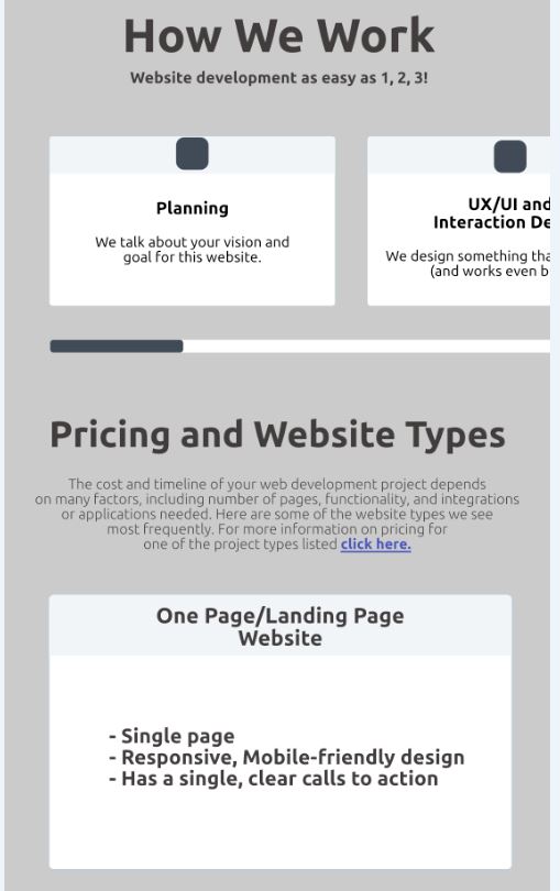
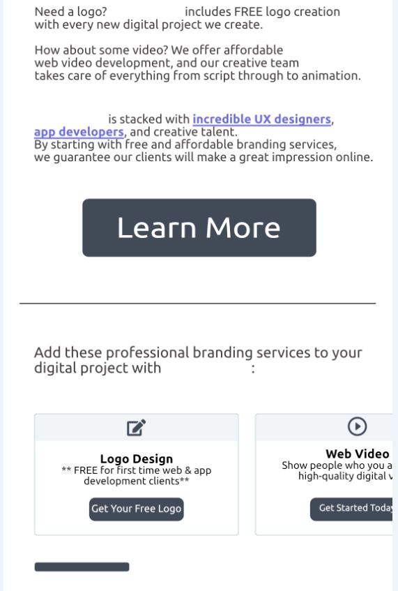
Based on the specifications from the creative brief, this is what the wireframe drawing looks like at the end:


Click here to view the wireframe.