Lost and Found App
Lost and Found App
Originally Created on January, 2018
Introduction
This project is the capstone project for the Online 1-on-1 UX Mentorship Program at Thinkful that utilizes techniques that are commonly used in User Experience design.
The Challenge
The primary goal for the the capstone project is to create a prototype of minimally viable app that mimics as the lost and found department.
The minimum requirements for this app are:
The person who lost item:
- Post the lost item on “Lost” section.
- Add description of the lost item and the reward of monetary value.
- Rewards the person who found the item.
The person who found the item:
- Post the found item on “Found” section.
- Add description of the found item.
- Receives the rewards from the person who lost the item.
The Approach
The Idea Map
Based on the minimum requirements of the app for the prototype, the idea map was created in order to visualize how the prototype would function. The map is drawn as follows:
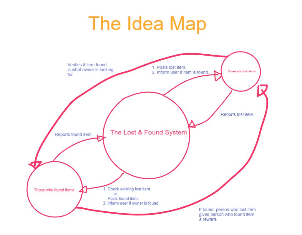
Drawing idea map not only shows how the prototype would function within the minimal requirements, but additional functions that supplement the minimal requirements are discovered in the process of the idea map. For instance, when the person who lost the item manages to get in contact with a person who found the item, verification function was added to ensure that the item is indeed belongs to the right owner.
User Persona Creation
The next step is the user persona creation. The idea map illustrates that the app mainly involves two actors, the person who lost item and the person who found the item. These are the actors who takes on the assigned roles:
Persona #1: The person who lost the item
Ashley – 27 years old who works at law firm in LA. She recently lost a camera while visiting a relative in San Diego.
Persona #2: The person who found the item
Jack – 32 years old who works as freelance DJ in San Diego. He one day found a camera that might have belonged to someone (in this case, Ashley’s).
The Scenario Chart
With the idea map and user persona in place, scenario chart is drawn to visualize the possible routs users might take to accomplish his/her goals. Basically there are four possible common scenarios based on idea map and user persona:
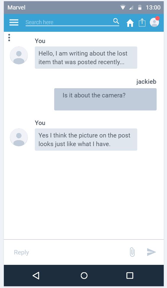
- Ashley lost a camera and reported it on the app. Jack found camera and saw a posting that matches the description. Jack contacts Ashley and both verified the item and Jack received the reward.
- Same as first scenario except Jack posted it first and Ashley contacted Jack later.
- Ashley lost a camera and tried to reported it on the app. The app suggested that there is already a posting about the lost camera. Turns it was Jack who found camera and posted it on app before her. Ashley contacts Jack and both verified the item and Jack received the reward.
- Same as third scenario but in reverse.
As for the chart itself, InVision Freehand was used to draw scenario chart instead of drawing on pen and paper. By going with this approach, great deal of time was saved compared to drawing with pen and paper.
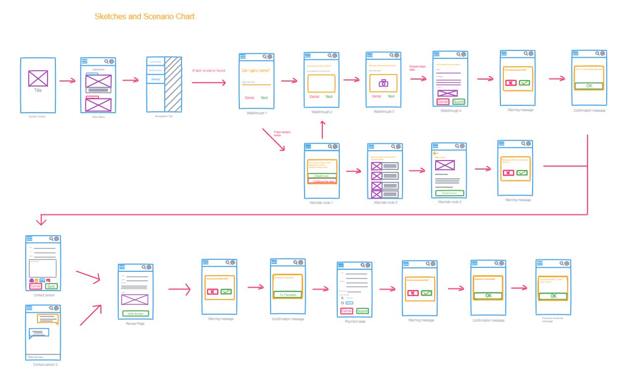
The detailed scenario chart is found HERE.
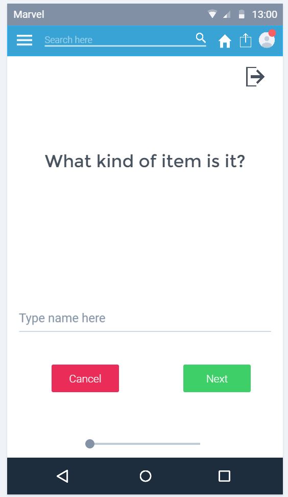
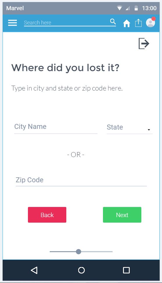
Prototype Design
Once the scenario chart has been drawn out, the sketch is critiqued to find out if there are any improvements necessary before the prototype is designed. Once the flaws and other design changes are sorted out, interactive prototype is created.
For this project, MarvelApp is used to design the prototype. MarvelApp was chosen for the prototyping tool because it is web-based and provides basic animation for the prototype to simulate as if user is using the real, full-fledged app.
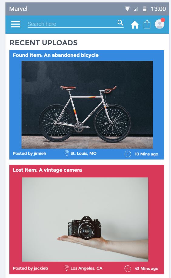
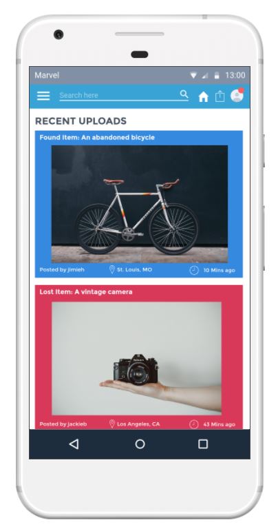
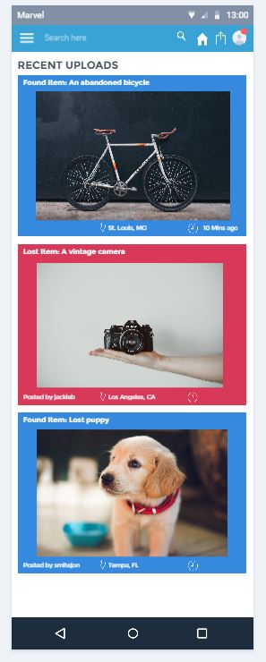
In this home page of the app, the layout is typical to the other apps that you find elsewhere. The main reason is that since the goal is to create minimally viable app in mind, simple layouts are used. For instance, most of the icons used are universally recognizable, fonts are basic sans serif, and the color are basic enough for users to recognize the meaning of the color.
Keeping the pattern of simplicity, the layout of other parts of the app is simple and basic. There are plenty of white spaces where users should be able to read and navigate throughout the app with ease.
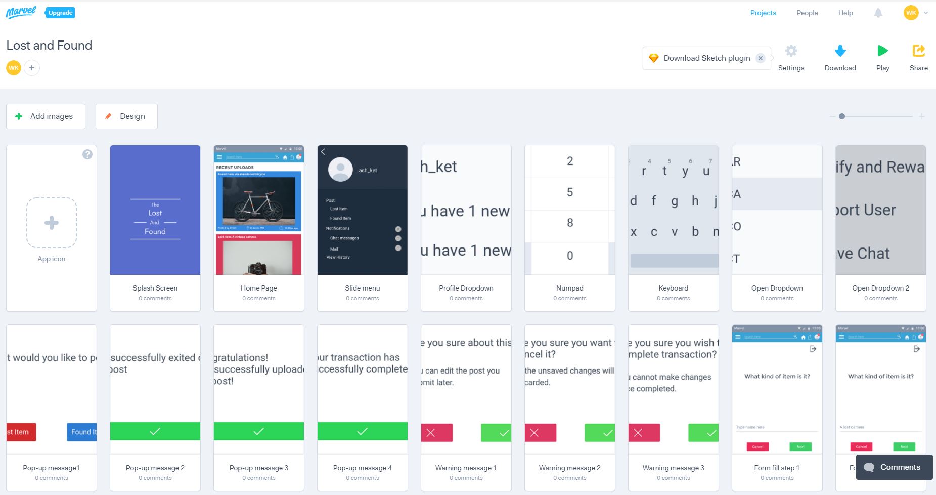
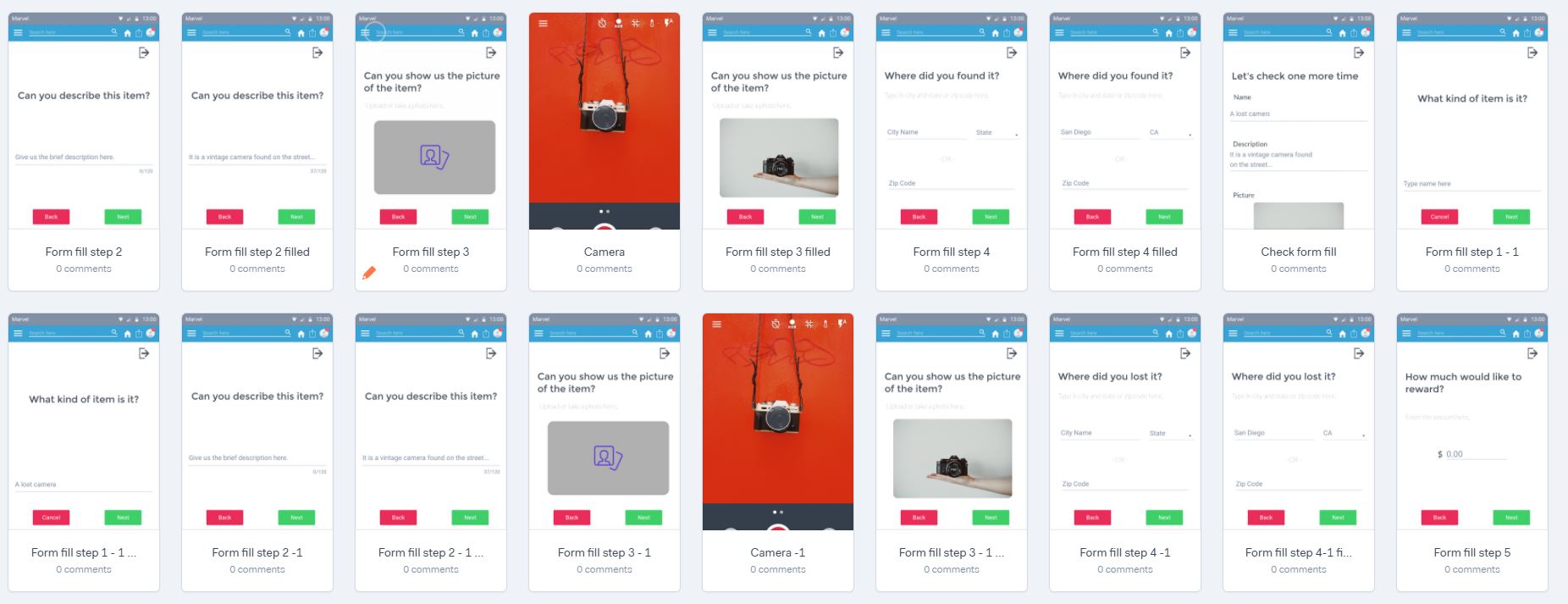
Overall, total of 54 slides are created for this prototype that accomplishes the intended goal, which is the lost item is found and returned to the rightful owner. Finally, the prototype is completed by adding basic animations such as transitions and linking the slides together from one state to another in order to behave like the real app.
User Testing
Once the prototype is completed, user testing is carried out by volunteer(s) to identify any problems that were overlooked or yet to be discovered in the previous stages. First, the volunteer answers the pretest questionnaire, mainly the basic profile of the volunteer. Next, the volunteer uses the prototype as if they are using the actual app and given the objective, volunteer must navigate through the app to reach the given target.
While reaching the goal, the volunteer must comment on the challenges the volunteer face while navigating through the prototype as much as possible. Once the testing is completed, volunteer answers the post-test questionnaire such as the problems with the app. Based on the feedback, designers resolve the issues the volunteer(s) found during the testing stage.
In this instance, these are the key highlights of the feedback from the volunteer:
- The volunteer is impressed by the clean, simple design and readability.
- The volunteer had some difficulty setting a reward amount when reporting lost item. This was due to mistakes made when designing the mockup. However, if that was the real-world app, that would consider as a flaw in the app for difficulty in navigating.
- The volunteer had trouble figuring out how to verify and reward the person who found the item. In fact, that was the most frustrating aspect of the app for that volunteer.
- The volunteer could not pay a reward through Paypal. Again, this was due to mistakes made when designing the mockup.
- Despite some difficulties navigating through verify and reward portion of the app, the volunteer was satisfied with this app in terms of overall experience.
Of course, in the real world scenario, the designers would improve the design based on the feedback and possibly test again to discover any more flaws. Since this assignment is mere just the exercise, no further improvements are made to this prototype.
Interactive Demo
You can check out the interactive demo here: